I’m on a mission to find the best writing apps for macOS out there. As an editor who cranks out tens of thousands of words per month, I’m putting these bad boys to the test, weeding out the good from the bad from the ugly to figure out which are worth your dough and which have no place in your dock.
After giving iA Writer a spin, I’m now shifting my focus to Typora.
Let’s start with the price: $14.99 for a lifetime license on three devices? I mean, talk about bang for your buck! Typora’s definitely making a case for being one of the most budget-friendly minimalist writing apps out there.
But the real question here is, is Typora any good? You know, the real deal for writing, proofreading, editing? Good old penmanship?
If you’re wondering about that yourself, it’s worth checking out. With a 15-day no-strings-attached trial, you can download the app and get typing. Simply head to the Typora website, hit the “Download” button and boom, the 13-megabyte .dmg file will be on your macOS computer. No emails, no credit card details, no intentionally buggy cancellation pages.
So let’s see if Typora can step up to the plate.
As a MacBook Air guy, I’ve been using Typora 1.4.8 for macOS. But don’t worry, the UI is similar and the pricing is the same for the Windows and Linux versions.

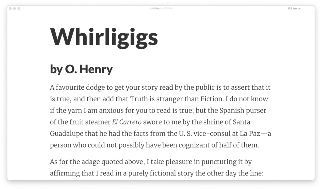
My first impressions with Typora were that it lived up to its hype. It positions itself as a markdown word editor that’s both readable and writable, and it delivers on that with its sleek, distraction-free interface and seamless live preview of formatted text.
Simply choose a theme, create a new file, and start writing. Typora’s got it all, from plain text with the occasional bold and italic words and headings to images, lists, tables, source code, and math formulas.
One of the cool things about Typora is that you can whip up flowchart, sequence, and mermaid diagrams right in your document by using only syntax. It’s a neat feature that comes in handy when you’re mapping out ideas or dialog visually.
There’s a sidebar that you can show and hide, which lets you organize your files and upload them to the cloud, like to your Dropbox or iCloud account. The outline panel gives you a list of your document’s headings and subheadings and lets you jump between sections of long-form content or books with ease.
Typora’s theme game is strong. This markdown editor is highly customizable, and there are at least a dozen themes to choose from in the theme library so you can make it look exactly how you want it to. Not all themes are great, but a few really did it for me. Some use modern, sans-serif fonts; others use classic, serif fonts — the choice is yours, my friends, it all comes down to what you want your text editor to look like.
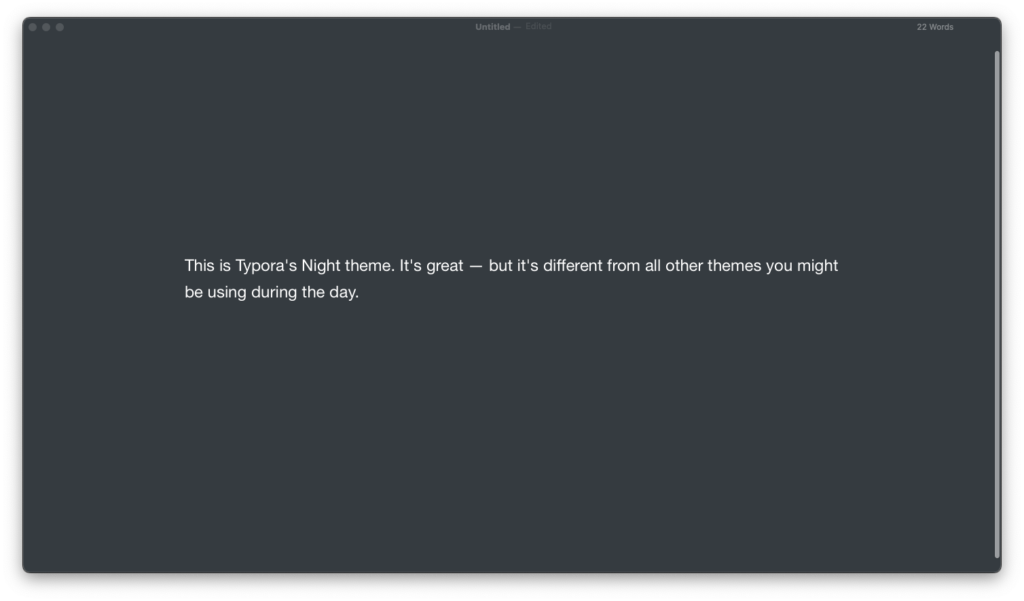
If you’re the tech-savvy kinda writer and you know your way around HTML and CSS, you can even create your own theme. But one aspect that leaves something to be desired is the lack of a distinct Light and Dark mode for each theme. Instead, most themes have a white background and there’s a separate “Night” theme for when you want to work on a dark background.


Yes, you can configure the app to switch between themes based on your system’s settings, but the reality is that the “Night” theme will look vastly different from the Light theme you’re using unless you take the time to create a copy and customize separate CSS styles so you have both — a task that may prove cumbersome for some users.
Also, if you’re someone who likes to increase and decrease the text size while you work or edit, it can be a hassle. Instead of using shortcuts, you have to go into the preferences menu and adjust the font size in pixels. You can zoom in and out, but it didn’t work for me, and I didn’t find it intuitive. It wasn’t a deal-breaker for me (I ended up buying Typora), but it’s something to know if you prioritize that level of flexibility.
It’s also harder than it should be to adjust the width of the lines; you have to go into the theme and edit the CSS. If you ask me, this should be something that you can change from the settings menu instead, like you can in other markdown text editors. It’s a small inconvenience, but it can be a pain if you work on different types of writing projects and you tweak your writing environment frequently.
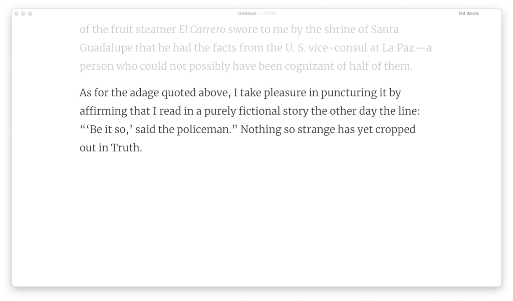
Like iA Writer, Typora has a focus and a typewriter mode, and they are on point.
In focus mode, the paragraph you’re currently writing or editing is darker (or, if you’re in dark mode, brighter) than the rest.
In typewriter mode, the line you’re typing right now is centered on the screen, allowing you to focus on one line at a time, dancing on the screen, so you can keep your eyes on the game and crank out those words like a champ.
Typewriter mode is where most text editors fall short. It’s tough to create a seamless transition from one line to the next, and every now and again things glitch and the text moves around in irritating ways. In the case of Typora, the text jumped slightly every time I began a new paragraph, which was a bit distracting (and if you’re like me and have slight OCD, it can be downright frustrating).
Once you’re done with your work, you can export the file in PDF, HTML, Image, DOCX, ODT, RTF, ePub, LaTeX, TXT, and OPML format. When you export your work as HTML or ePub, you can append custom code to the and tags of your document. Typora is pretty powerful in this area, and it’s one of the best minimalist text editors when it comes to file formats.
The bottom line?
I think Typora’s a genuinely good minimalist writing app. With markdown formatting, a minimalist interface, and plenty of file formats for exporting finished work, it gives good value and sells at a reasonable price.
Typora has a few quirks, like every minimalist writing app, and doesn’t have the bells and whistles that the heavyweights like iA writer and Ulysses do. But if you’re looking for a lightweight and uncomplicated text editor to help you get those words “on paper,” give it a shot. It might just turn out to be the editor for you!

