Sometimes, the background image in your design is a little too overwhelming for the eyes of the viewer. In this case, color overlays are very useful.
With a color overlay, you apply some sort of tint to the background image of your Canva design to tone down the colors a bit so that the text and design elements in the foreground stand out more.
This technique—especially if you select the color and opacity of your color overlay well—makes your designs more readable and gives them that professional touch.
So let’s talk about how you can do it!
How to Add an Overlay in Canva
Step 1: Fire up your favorite web browser and go to Canva.com, or open the Canva app from the shortcut if you have it installed on your computer.
Step 2: Create a new design. If you want to add a color overlay to an existing design, open it for editing.
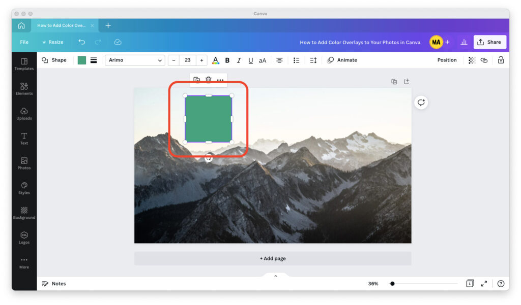
Step 3: Open the “Elements” tab in the left pane, then type “rectangle” in the search box and hit the Enter key on your keyboard to bring up the rectangular design element.

Step 4: Drag and drop the rectangle into your Canva design.

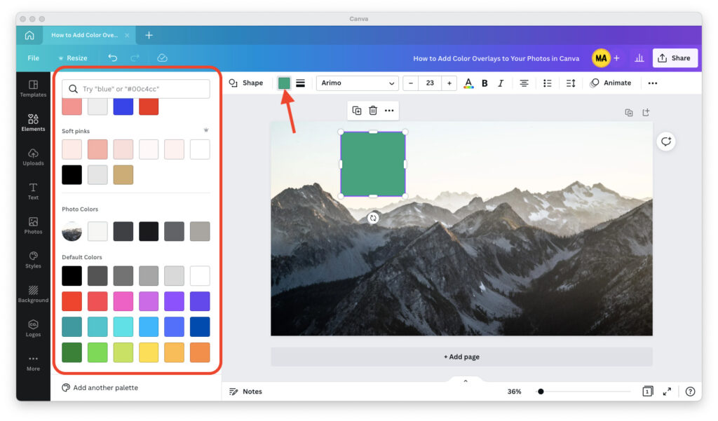
Step 5: Open the color picker in the top toolbar and give your rectangle the color you want.

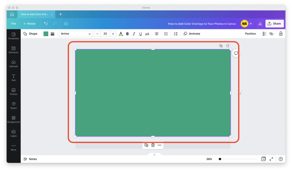
Step 6: Resize the rectangle so it takes up 100% of the height and width of your design.

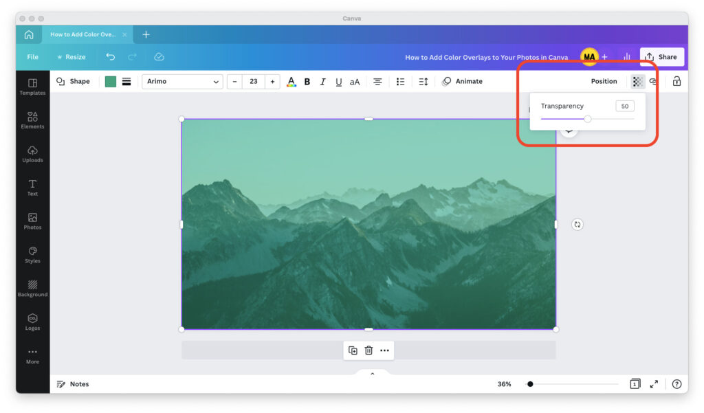
Step 7: Click on the transparency icon in the upper right corner and make your rectangle 50% transparent.

Step 8: If you like how it looks, you’re all set! If you don’t, play around with the color and the transparency of the rectangle until it’s “just right.”
Tips for Adding Color Overlays to Your Canva Designs
When I add overlays to my designs in Canva, it usually takes me a while to find the color and transparency that makes my images look exactly the way I want them to.
It will probably take you a few tries, too. A few tips for the process:
Darker background images, like a city at night, benefit from a black overlay and design elements with bright colors in the foreground.
Lighter background images, like the beach, benefit from a white overlay and design elements with dark colors in the foreground.
If you don’t know which colors to use, try our favorite color palette tool, Coolors. Simply start the color palette generator, enter and lock in your design’s colors, then hit the Spacebar button on your keyboard and let Coolors do the rest.
Setting the transparency for your overlay is almost always a Goldilocks dilemma.
On the one hand, you don’t want the overlay to be too opaque because then it will be hard to see what’s in the background. On the other, you don’t want it to be too transparent because then it can’t do its job, which is to help the elements in the foreground stand out.

