Did you know that you can create charts—beautiful, information-rich charts—in Canva?
Canva allows you to create three types of charts: pie charts, bar charts, and line charts. You can enter the data for the charts manually or import it from a Google Sheets spreadsheet.
This tutorial will show you how to do this, step-by-step and with screenshots.
How to Create Charts in Canva
Step 1: Go to Canva, create or open the Canva design where you want to insert the chart, and then tap the forward slash key (“/”) on your keyboard to open the magic shortcuts menu.

Step 2: Type “chart” in the magic shortcuts menu and three options will show up: Pie chart, Bar chart, and Line chart. Decide which type of chart you want and click it.

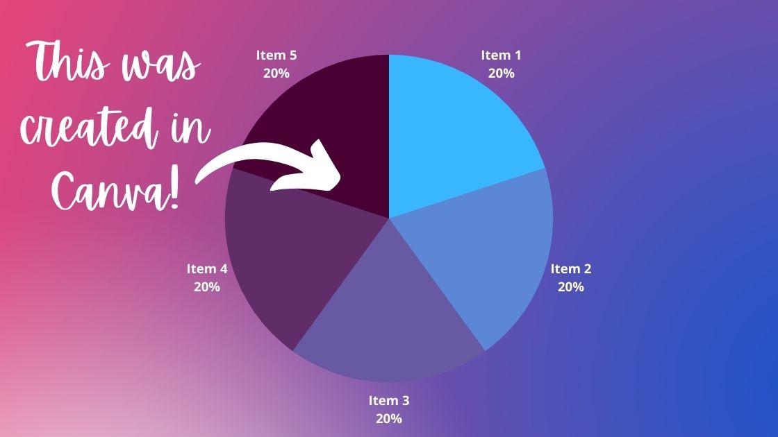
For this tutorial, I will create a pie chart. However, the editing process is the same for each type of chart, so follow along with this example no matter what type of chart you want to include in your Canva design.
Step 3: A chart is inserted into your Canva design, with all the options you need to edit the data on it and customize its look and feel to your liking.
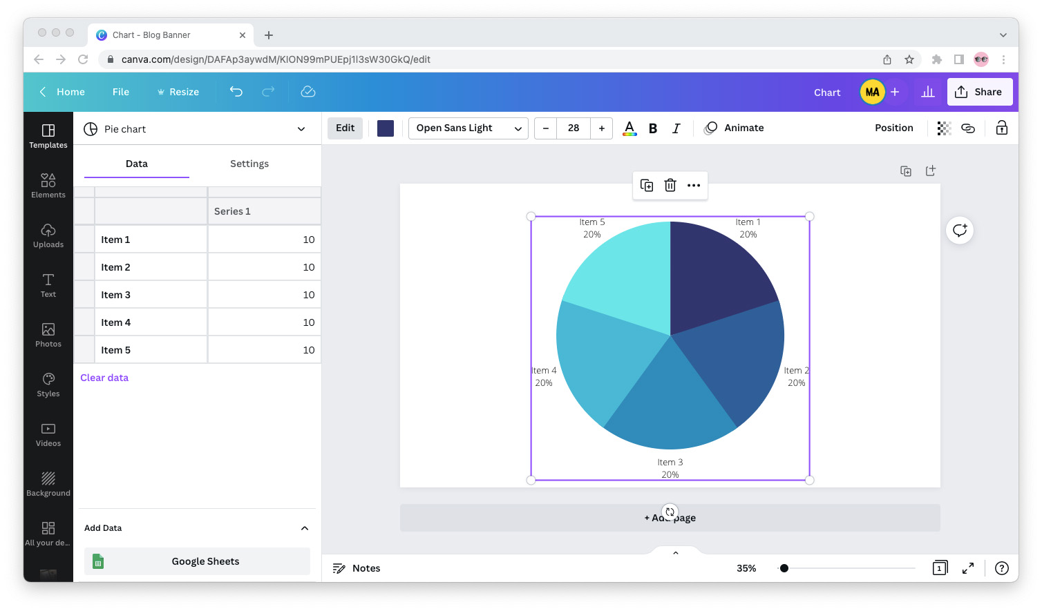
From the sidebar to the left, you can edit the data and settings for your chart. You can type in the data for your chart manually or you can add data from a Google Sheets spreadsheet.
From the top bar, you can customize the look and feel of your chart by tweaking its colors, fonts, and animations.
Step 4: When you’re done editing your chart, click the “Share” button in the upper right corner to export it.
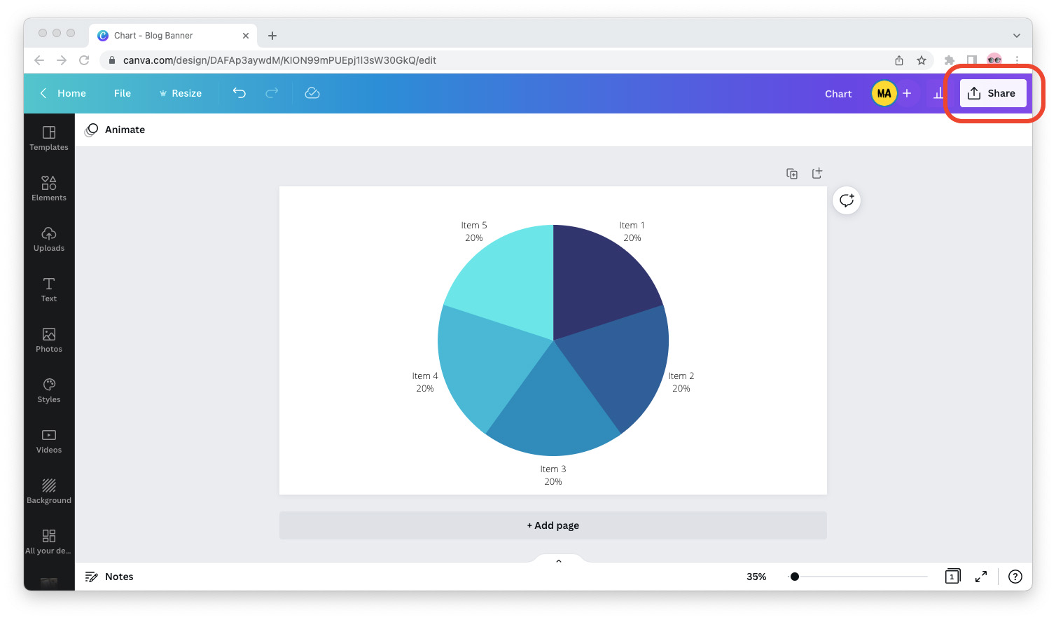
If you want to use the chart in a presentation or document that wasn’t created in Canva, I recommend exporting it as a PNG file with a transparent background.
If you want to use the chart on your website, exporting it as a JPG file will make it smaller, and thus faster to load.
How to Choose What Type of Chart to Insert
You can create pie charts, bar charts, and line charts in Canva… but what if you don’t know what type of chart to use for your information visualization needs?
The National Center for Education Statistics (NCES) gives the following guidance:
Use a pie chart when you’re comparing the parts of a whole. For example, if you ran a survey and you want to show what percentage of your respondents choose answers A versus B on a question.
Use a bar chart when you’re comparing things between different groups. For example, if you want to visualize how many people from Group 1 agree with a statement compared to those in Group 2.
Use a line chart to show changes to a figure over a period of time. For example, if you want to visualize the inflation rate in the US since the year 2000.